When the first phase of discovery closed, the client and my own team were ready to call it finished, with patient and provider needs fully mapped and ready to hand to build. I saw it differently. We’d captured a snapshot of a relationship that would keep moving the moment we improved it, because better experiences raise expectations rather than settle them. The findings were never the real deliverable. The client needed a way for those findings to keep evolving once my team moved on.

Provider and stakeholder engagement map — used to scope the discovery methodology and later to negotiate the feedback-loop handoff with each state’s team.
ROLE
Creative Lead, discovery across two engagements, customer-facing patient and provider portals
TIMELINE
Engagement 1: 9 months. Engagement 2: 8 months, 4 months later
TEAM
3 UX designers, 2 UX researchers, 1 content strategist, 2 front-end developers
STAKEHOLDERS
Managed care payer product leadership, internal development leads, content and marketing ops
TOOLS / SYSTEMS
Sitecore
CONSTRAINTS
Multi-state regulatory variance, design team not staffed to own content long-term
The Lesson I Had to Learn Twice
Patients were navigating dense, regulation-heavy content to make decisions about their own care, while providers were losing hours to authorization friction the system itself created. Neither problem was going to resolve with a single round of research, however thorough, and ours was thorough. It spanned six states, 14 provider organizations, and 92 distinct feature requests and challenges surfaced through interviews and a structured survey. That scale is exactly what made the client’s instinct to call it done so understandable. A dataset that size feels conclusive. It isn’t, when the population it describes keeps changing in response to the very product you’re about to ship.
The Idea That Didn’t Land
I made that case on the first engagement, focused on the patient portal, and it didn’t land. My team spent the better part of a year past hypercare absorbing content rework, because nothing but us was keeping the content current.

Persona depiction of a dual eligibility healthcare patient highlighting their key attributes for engaging with managed care digital experiences.
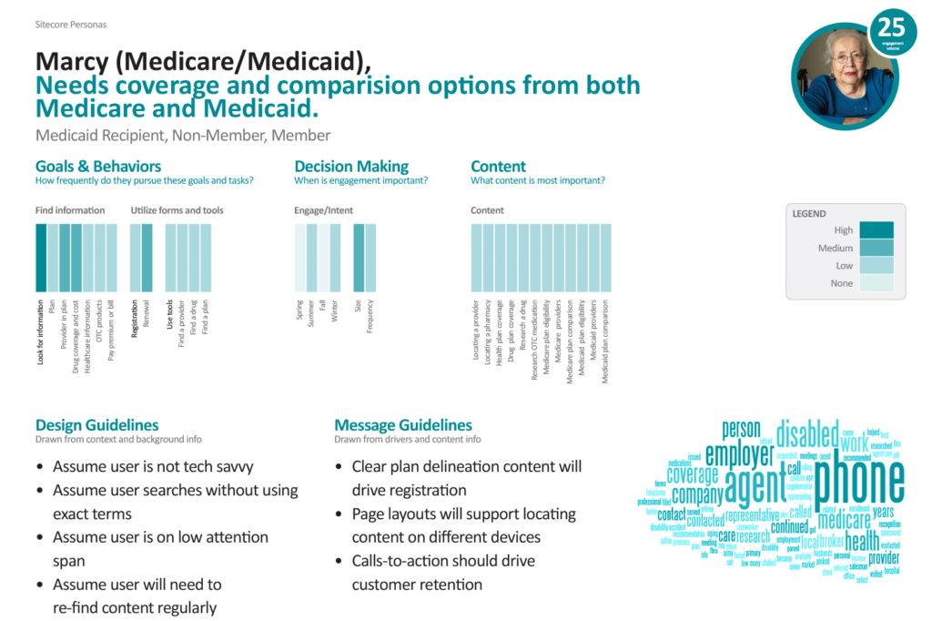
Persona depiction of a dual eligibility healthcare patient highlighting their key content interaction attributes for a managed care digital experiences.

Persona depiction of a healthcare patient caregiver highlighting their key attributes for engaging with managed care digital experiences.
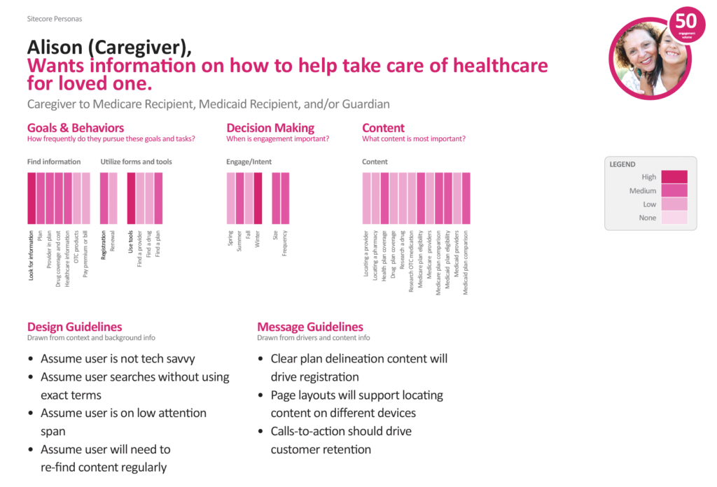
Persona depiction of a healthcare patient caregiver highlighting their key content interaction attributes for a managed care digital experiences.
The Reversal
Going into the provider portal engagement, I had the chance to apply that lesson and got the application half wrong. I prioritized deepening the feedback-loop research over supporting the development team’s build. I believed our differentiated value sat in evidence-based content, not handoff. That prioritization ran long, because the loop we were designing needed more than research behind it. It needed a mechanism the client’s own team could run without us.

Persona depiction of a medical administrator managed healthcare provider highlighting their key attributes for engaging with managed care digital experiences.

Persona depiction of a medical administrator healthcare provider highlighting their key content interaction attributes for a managed care digital experiences.

Persona depiction of a patient intake representative managed healthcare provider highlighting their key attributes for engaging with managed care digital experiences.

Persona depiction of a patient intake representative healthcare provider highlighting their key content interaction attributes for a managed care digital experiences.
That’s where I found the real gap. Personalization containers were enabled platform-wide, but only a fraction of the zones on any page were configured to actually surface them. That meant every recommendation coming out of our research was landing on content creators with no map of what was actionable.
I reversed course and had my team build a content-to-zone mapping document instead. It specified which containers were live where, what development still needed to configure, and how content creators should use personalization from that point forward. The cost was polish on the enrichment work itself. What we got back was the one artifact that let the client run the feedback loop themselves, which had been the point since the first engagement.
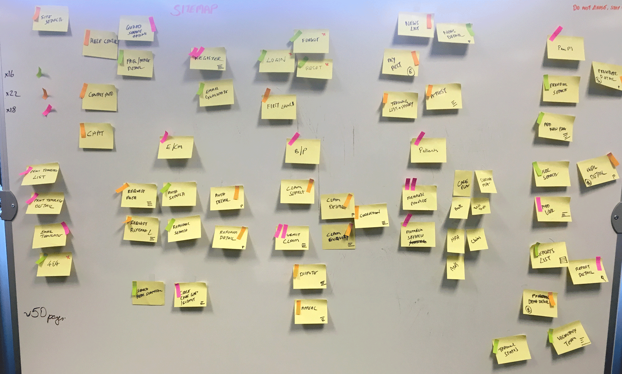
Whiteboard session with sticky notes mapping provider portal information architecture

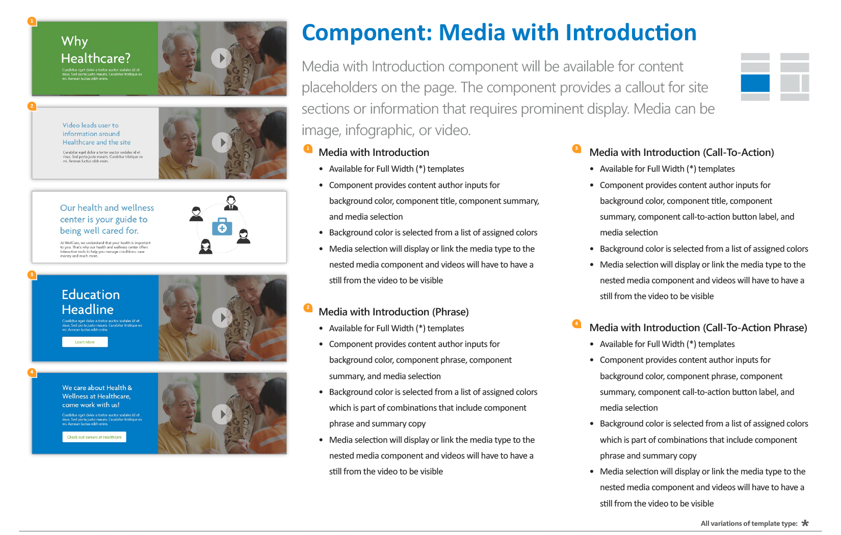
The dev-to-content-creator handoff blueprint that closed the container and zone gap.
Where the Evidence Ends
The perspective we were designing under wasn’t abstract. Limited health literacy affects up to 36% of adults, and patients who struggle to parse complex healthcare information consistently see worse outcomes. In that context, plain language and side-by-side plan comparisons weren’t cosmetic choices. They were the difference between a patient understanding their options and guessing at them. Providers navigating fragmented systems report real increases in cognitive load and burnout, which is the same reason workflow alignment mattered on the other side of the platform. Those are field-level findings, not claims about what this specific project measured.
Health literacy sourced: National Assessment of Adult Literacy, National Center for Education Statistics, 2003
What I Can Actually Stand Behind
Standing up the feedback loop on the second engagement visibly reduced my team’s post-launch maintenance load relative to the first engagement, where no loop existed.
The content-to-zone mapping document gave development and content teams a shared reference that stabilized personalization deployment after we rolled off.
The redesigned IA consolidated cross-provider account views and Tax ID-based auto-population, the two highest-scored structural requests in a 92-item feature survey across 14 provider organizations.
sourced: OnlineCARE Provider Research Database

Feature-priority matrix from the original research database. Cross-provider account views and Tax ID auto-population scored highest among structural asks.
The Practice This Project Started
The feedback mechanism should have been contracted into the first engagement, priced and staffed like any other deliverable, not offered as a recommendation and left to survive a delivery schedule on its own. Non-negotiable scope, not aspiration. The rework we absorbed afterward wasn’t bad luck. It was the direct cost of treating governance as optional.
The larger shift was in how I categorize deliverables. A document that lets another team maintain quality after mine has rolled off isn’t a courtesy attached to the design work. It is the design work, the part that determines whether everything else holds up once attention moves elsewhere. I didn’t have that distinction sharp enough to defend on this engagement. I do now, and it’s changed how I scope every engagement since. The feedback and handoff mechanism gets negotiated into the statement of work at the outset, not pitched once the team’s already moved on to the next thing.
Interested in building a research practice that keeps working after your team rolls off the engagement?
Continue Exploring

Bringing the Grid to the Table
A missed disconnection notice isn’t a UX gap. It’s a customer finding out the power’s off when the lights don’t come on.

Making Payments Make Sense
A cashier guessing which fields depend on which isn’t friction. On a platform touching over 130 million merchants, it’s a lost transaction.