The cost of a staffing shortfall on a multi-year drilling project is an idle rig, a missed safety window, or a crew flown in too late to matter. A global oil and gas company was carrying exactly that risk, running workforce forecasting across five disconnected systems with no shared source of truth, and CapEx and OpEx exposure running ten to one hundred million dollars a year on the decisions that tool was supposed to inform. I led design on the team building its replacement, and the one dataset I could actually validate against was already five years out of date.

ROLE
Creative Lead, workforce forecasting platform
TIMELINE
Engagement: 6 months broken up over 9 months
TEAM
2 UX designers, 1 UX researcher, 3 visual designers
STAKEHOLDERS
Internal subject matter experts serving as proxy users, onshore business analysts, nearshore design team, offshore development team, program leadership
TOOLS / SYSTEMS
MSFT Dynamics, Interactive prototyping (Adobe XD), heuristic analysis across five legacy systems, Miller Column interaction pattern testing
CONSTRAINTS
Most recent usable validation dataset five years old, with newer data locked behind content-sensitivity restrictions; internal subject matter experts standing in for actual decision-makers; team distributed across three time zones and three reporting lines
Designing for Data You Couldn’t Fully Trust
The team itself spanned three time zones and three different reporting lines: internal subject matter experts standing in as proxy users, an onshore business analyst group, a nearshore design team, and an offshore development team, none of whom had worked from the same forecasting assumptions before. Getting everyone aligned on what “accurate” even meant took longer than any single design decision. The clearest test came in how leadership would select and group resources for a forecast. We tested four different interaction patterns before landing on a nested Miller Column structure, validated against the only usage data available. Real historical resourcing decisions existed, but the most recent usable set was five years old, since anything newer sat behind content-sensitivity restrictions.
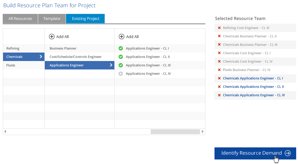
Four tested. One pattern lit the path.
I couldn’t validate the design against how leadership makes decisions today. I could only validate it against how they made decisions five years ago, and I was honest with the team about exactly where that left a gap.
The artifacts here are concrete. The five-system heuristic analysis and the Miller Column prototype were tested and validated across four refinement iterations before anything shipped. The resource-utilization and delay-reduction improvements are outcomes the client reported after rollout; I can’t isolate my team’s design contribution from the underlying data-integration work happening in parallel, since both were necessary for the tool to function at all. My defensible claim is narrower. Leadership went from five disconnected systems with no shared definition of “available” to one interface that every stakeholder, across every time zone, was finally reading the same way.
Interested in unifying scattered forecasting tools into one interface teams can actually trust?
Continue Exploring

Making Payments Make Sense
A cashier guessing which fields depend on which isn’t friction. On a platform touching over 130 million merchants, it’s a lost transaction.

The Loop Healthcare Forgot to Build
Patient and provider needs don’t stay mapped. They keep moving the moment the experience actually improves.